
Nano Banana Pro Prompts: 16 Tested for Text and Layouts
16 Nano Banana Pro prompts for posters, labels, charts, comics, app screens and headshots, tested free in Google Flow, with every result and two fixes.
Contents
Nano Banana Pro prompts that worked, in one table
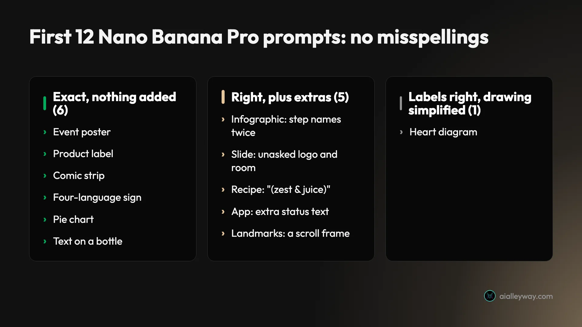
The best Nano Banana Pro prompts are the ones with words in them. I ran 16 prompts through Nano Banana Pro in Google Flow on 3 October 2026: a poster, a label, a slide, charts, a comic, a recipe card, an app screen, a sign in four languages and three photos. It made no spelling mistakes in any of them. Of the first 12, six came back with exactly the text I asked for and nothing else. Five came back with extras; I rewrote two of those to describe the plain version, and both came back clean.
| Prompt | Result |
|---|---|
| Poster, label, comic, four-language sign, pie chart, bottle photo | Every word exact, nothing added |
| Infographic, slide, recipe card, app screen | All text right, plus extras I did not ask for |
| Infographic and slide, rewritten | Extras gone |
| Landmarks with city labels | Labels right, drawn on a scroll I did not ask for |
| Labelled heart diagram | Labels right and on the right sides, simplified drawing |
| Headshot, then the same woman in an office | Convincing photos, a very similar face |
Every prompt is below, word for word, with the Nano Banana Pro example it produced. I made them for free: my account has no Google AI plan, and Flow’s 50 daily credits were untouched afterwards.
Sixteen Nano Banana Pro examples from one free Flow session
I built the first 12 prompts around text on purpose. Google’s developer docs call Nano Banana Pro its premium choice for the most complex visual tasks, and its help pages credit it with advanced text and language capabilities. If Pro is worth choosing for anything, it should show on prompts like these. So every one asks for specific words, numbers or labels, and most ask for several: the recipe card alone has a title, five ingredients and three numbered steps.
Each prompt ran once, in one Flow project, with no retries. I set Flow’s image settings to Nano Banana Pro and one image at a time, and chose a shape for each batch. Each image took about 80 to 110 seconds to arrive. After reviewing the first 12, I ran four more: a headshot, the same woman in a new scene, and rewrites of two prompts that had come back with extras.
Two caveats matter. Flow’s chat agent reads your prompt before it generates and can reword it, so the model may not always see your exact words. In an earlier Flow test it changed “photorealistic” to “photorealistic style”; the one info panel I checked this time showed my pie chart prompt unchanged. And Flow ignored my shape setting on five of the first twelve images, which I come back to below. Our Nano Banana Pro free guide shows how to set Flow up the same way.
What Google’s own guide says
Google published its advice in a Nano Banana prompting guide on its Cloud blog in March 2026, and it covers both Nano Banana Pro and Nano Banana 2. Its core formula for a new image is “[Subject] + [Action] + [Location/context] + [Composition] + [Style]”, and it warns that “a simple list of keywords won’t cut it; you need to describe the scene narratively.”
For text, which is where Pro earns its price, the guide gives four rules: put the words you want in quotes, describe the typography or name the font, write the prompt in one language and name the target language for the text, and draft the wording with Gemini first. Separately, it tells you to “use positive framing: describe what you want, not what you don’t want”.
My first round followed these only partly. I quoted the titles and main lines in most prompts and named a lettering style in one. Some labels went unquoted, such as the heart’s six parts and the pie’s slice names, and they still came out right, so this test cannot show that the quotes are what did it. The positive-framing rule is the one I tested deliberately: the two results I rewrote with it came back clean, though each rewrite changed several things at once.
Where to run these prompts
Google offers Nano Banana Pro in several places, and each wraps your prompt differently.
| Route | Cost | What happens to your prompt |
|---|---|---|
| Google Flow | Free in my test | A chat agent reads it, may reword it, then generates |
| Gemini app | Needs a Google AI plan for Pro | You redo an existing image with Pro, per Google’s help page |
| Gemini API (or AI Studio with an API key) | About $0.134 per 1K or 2K image | No agent in between; not tested here |
I used Flow because it was the only free way to reach Pro. The cost is that Flow’s agent sits between you and the model, and in my first round it chose its own shape five times.
In the Gemini app you do not pick Pro up front. Google’s help page describes Pro as Redo with Pro, available on a Google AI plan when the model is set to Pro, so each Pro image starts as a Nano Banana 2 image. The same page says that hitting your daily Nano Banana 2 quota blocks further Pro redos. Our Nano Banana Pro pricing guide sets out what each route costs.
Infographic, slide and chart prompts
Pro is the model to use when an image has to explain something. These prompts were the most demanding in the test, and the two I rewrote are shown with both versions.
A five-step process infographic
An infographic titled "How a Coffee Bean Becomes Your Espresso" with five numbered steps: 1 Harvest, 2 Process, 3 Roast, 4 Grind, 5 Brew. Each step has a small icon and one short caption. Clean flat style on a cream background.A wide 16:9 infographic titled "How a Coffee Bean Becomes Your Espresso" with five numbered steps in a row: 1 Harvest, 2 Process, 3 Roast, 4 Grind, 5 Brew. Label each step once: its number and name above a small icon, and one short caption below. Clean flat style on a cream background.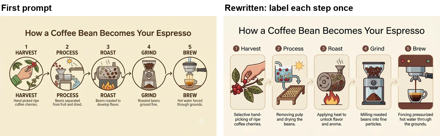
The first version got the title and all five steps right, in order, with arrows and a sensible caption under each, but it printed every step name twice. The rewrite says exactly where each label goes and that it appears once, and the duplicates disappeared. It also came out in the wide shape I wrote into the prompt, even though Flow’s setting was on portrait by then.
A slide with a bar chart
A presentation slide titled "Q3 Revenue" with a bar chart of monthly revenue: July $42k, August $51k, September $63k. Label each bar with its value and add one takeaway line under the chart: "Up 50% in one quarter". Clean corporate style.A flat 16:9 presentation slide that fills the whole frame, plain white background, containing only these three elements: the title "Q3 Revenue" in a bold sans-serif font; a bar chart of monthly revenue with July $42k, August $51k and September $63k, each bar labelled with its value; and one line under the chart: "Up 50% in one quarter".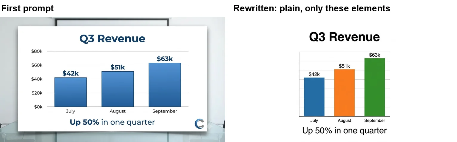
The chart in the first version is the best thing Pro drew all day. The bars match a $0 to $80k axis exactly. But Pro also staged the slide on a screen in a meeting room and added a made-up circular logo. The rewrite describes the plain version instead of listing what to leave out: a flat slide, a white background, only these three elements. The room and the logo were gone, the bars stayed in exact proportion, and the slide came out wide as written. It did drop the axis numbers, which I had not asked for this time.
A pie chart and a labelled diagram
A pie chart titled "How I spend my day" with four labelled slices: Sleep 33%, Work 38%, Leisure 17%, Commute 12%. Each slice sized correctly and labelled with its name and percentage. Flat infographic style.A labelled cutaway diagram of the human heart, viewed from the front, with six labels: left atrium, right atrium, left ventricle, right ventricle, aorta and pulmonary artery. Clean textbook illustration style on white.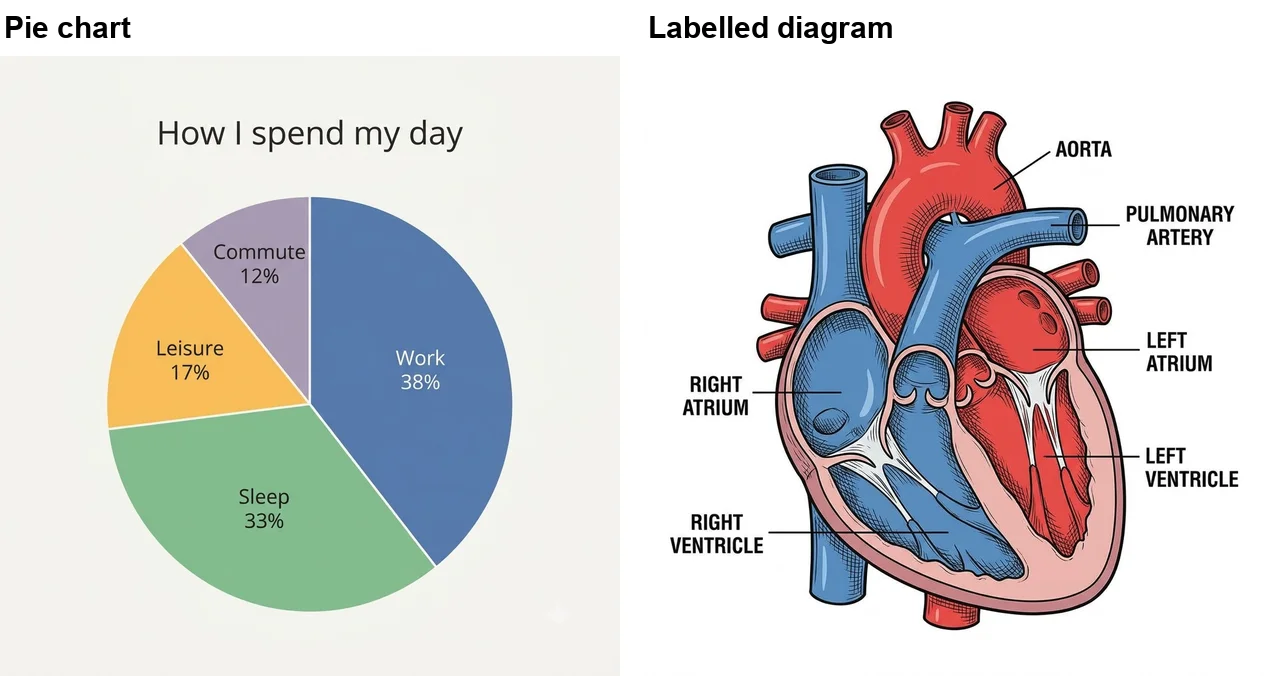
I measured the pie slices: about 39, 34, 16 and 11 percent against the 38, 33, 17 and 12 I asked for, so within two points each. The labels are exact. The heart diagram puts all six labels on the right parts, with the right side of the heart on the viewer’s left as textbooks draw it, but the vessels and chambers are drawn in a simplified way. It is fine for a blog post, not for an anatomy exam.
Poster, label and sign prompts
These are the text-first jobs Pro suits best, and all four came back with every word exact and nothing added.
An event poster and a product label
A poster for the "Riverside Book Fair" on "Saturday 18 October, 10am to 4pm" at "Old Town Hall", with three smaller lines: "Over 40 sellers", "Free entry" and "Children's reading corner". Modern Swiss poster design.A front label for a jar of honey called "Wild Meadow Honey", with the lines "Raw & Unfiltered", "Net wt 340 g" and "Harvested in Devon" in smaller text. Vintage engraved illustration style with a bee.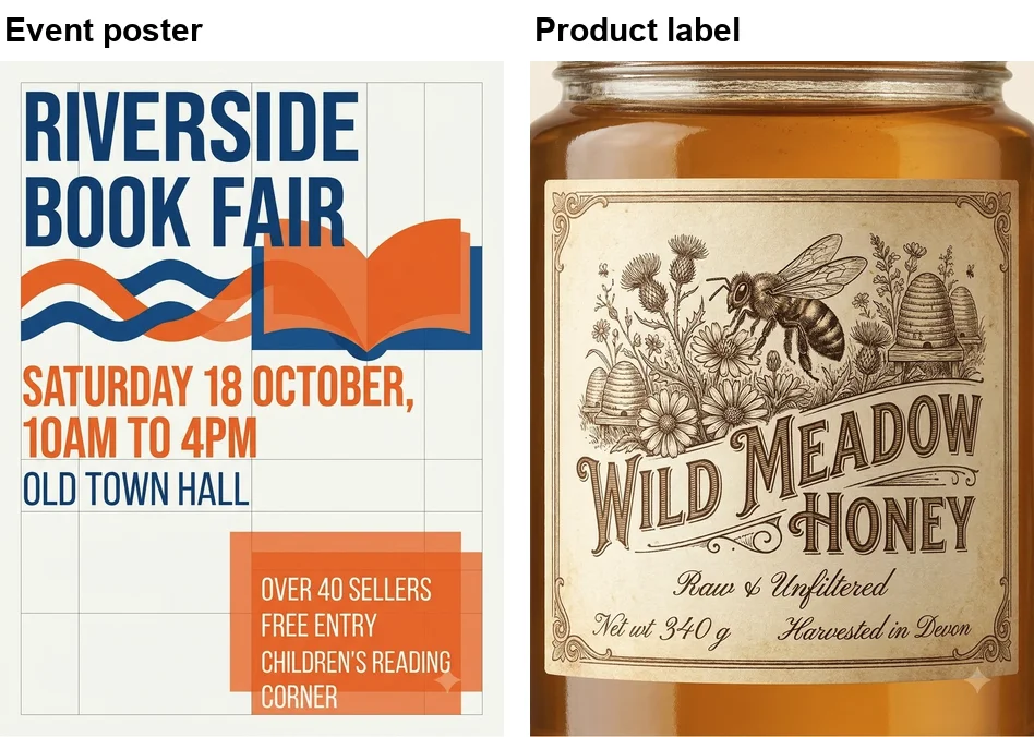
The poster set all six pieces of text in a clean grid, in capitals, which is a Swiss-style choice rather than an error. The last word of the small print drops below the darker orange panel, though it stays inside the lighter box. The honey label is the most attractive image of the sixteen: engraved bee, wild flowers, straw hives, and all four lines exact, with the brand name in capitals and the ampersand and the space in “340 g” kept. Pro showed the label on a jar, a fair reading of “a front label for a jar”.
A four-language sign and text on a product photo
A cafe window sign with the word for "open" in four languages, each on its own line: "Open", "Abierto", "Ouvert" and "Geöffnet". Hand-painted gold lettering on glass, cafe interior softly blurred behind.A product photo of a matte white water bottle standing on a wooden gym bench, with the word "HYDRATE" printed vertically down the bottle in black. Soft natural window light, shallow depth of field.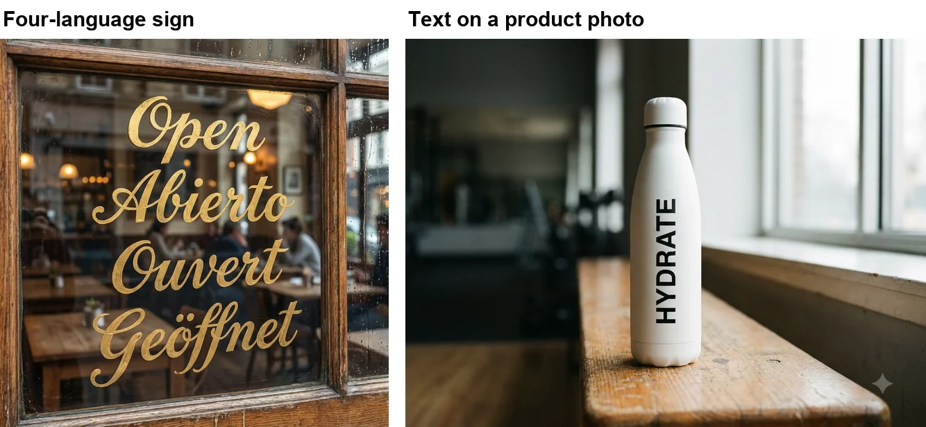
Both are exact. The sign spells Geöffnet with its umlaut and reads correctly from outside the glass. The bottle carries “HYDRATE” running down its side, the kind of detail that makes a mock-up usable for a pitch. Google’s guide says the two models it covers support text in over ten languages; one German umlaut is a small test of that, but it passed.
Comic, recipe card and app screen prompts
These test whether Pro can keep a layout together across several parts, each with its own text.
A four-panel comic strip
A four-panel comic strip of a cat trying to catch a red laser dot, with one speech bubble per panel: panel 1 "There it is!", panel 2 "Almost...", panel 3 "Where did it go?", panel 4 "I meant to do that." Simple cartoon style.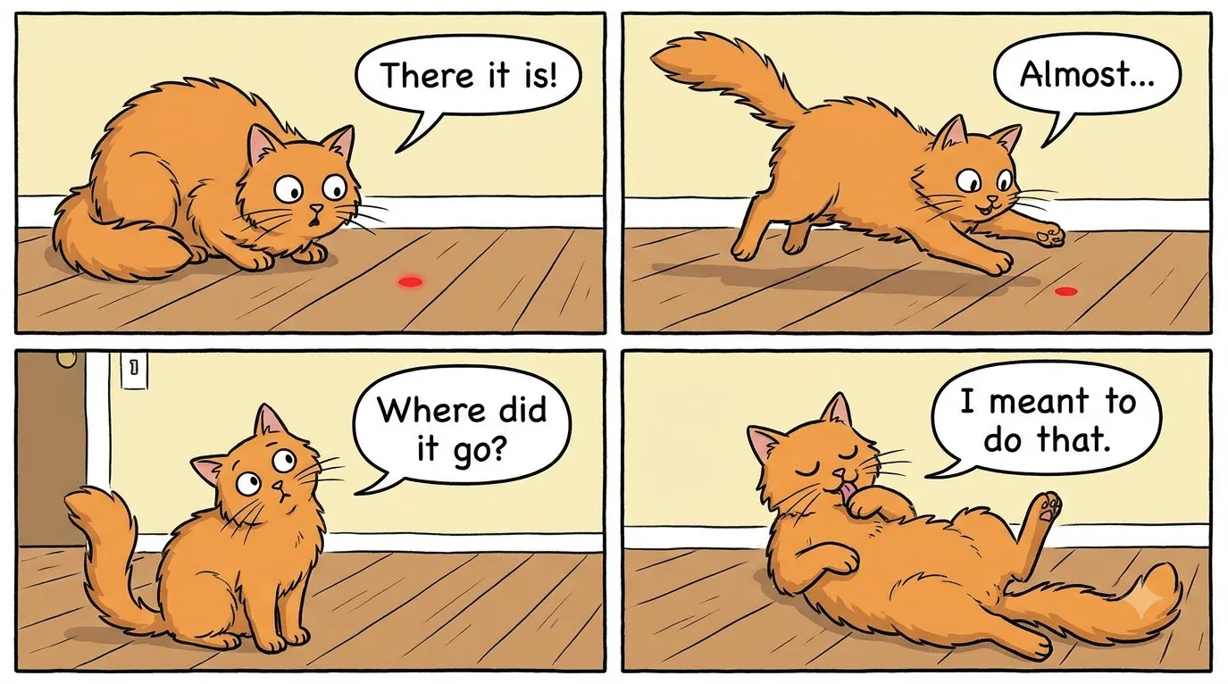
All four bubbles are exact and in the right panels, the same orange cat appears in every frame, and the dot disappears in panel 3 exactly when the cat asks where it went. It is a good template for any short strip: name the panel count, then give each panel its line in quotes.
A recipe card and an app screen
A recipe card for "Lemon Pancakes". Ingredients: 200 g flour, 2 eggs, 300 ml milk, 1 lemon, 1 tbsp sugar. Method: 1. Whisk the flour, eggs and milk. 2. Stir in the lemon zest and sugar. 3. Fry small ladlefuls for 2 minutes each side. Clean, friendly cookbook layout with a small illustration.A mobile app screen for a habit tracker. Title "Today". Three habit cards: "Drink water" showing 6/8 glasses, "Read 20 min" with a green tick, "Walk 5,000 steps" showing 3,200 so far. A bottom navigation bar with Home, Stats and Settings. Clean modern UI design.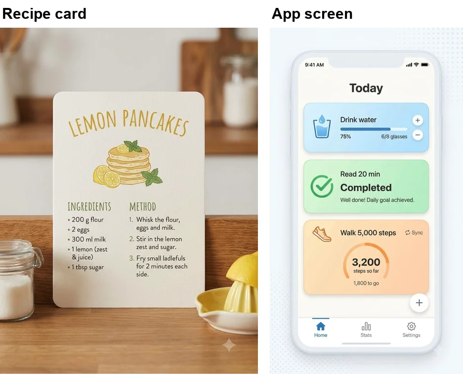
The recipe card has every ingredient and step, with one change: “1 lemon” became “1 lemon (zest & juice)”. It is a reasonable guess, but it is not what I wrote, and Pro chose to show the card as a photo in a kitchen rather than a flat design. The app screen has every element I listed and adds sensible extras: 75%, “1,800 to go”, a “Completed” badge and a status bar. The added numbers are even right, since 6 of 8 is 75% and 5,000 minus 3,200 is 1,800.
Photo prompts: a headshot and the same person again
Pro is not only for text. Portraits and reusable characters are common requests, so I ran one of each, with no uploaded photo.
A tall 3:4 professional headshot of a woman in her forties with short grey hair and a navy blazer, smiling, plain light-grey studio background, soft key light, 85mm lens, photorealistic.Now show the same woman from that headshot, with the same face and short grey hair, sitting at a desk in a bright office and typing on a laptop. Wide 4:3 photo, natural window light, photorealistic.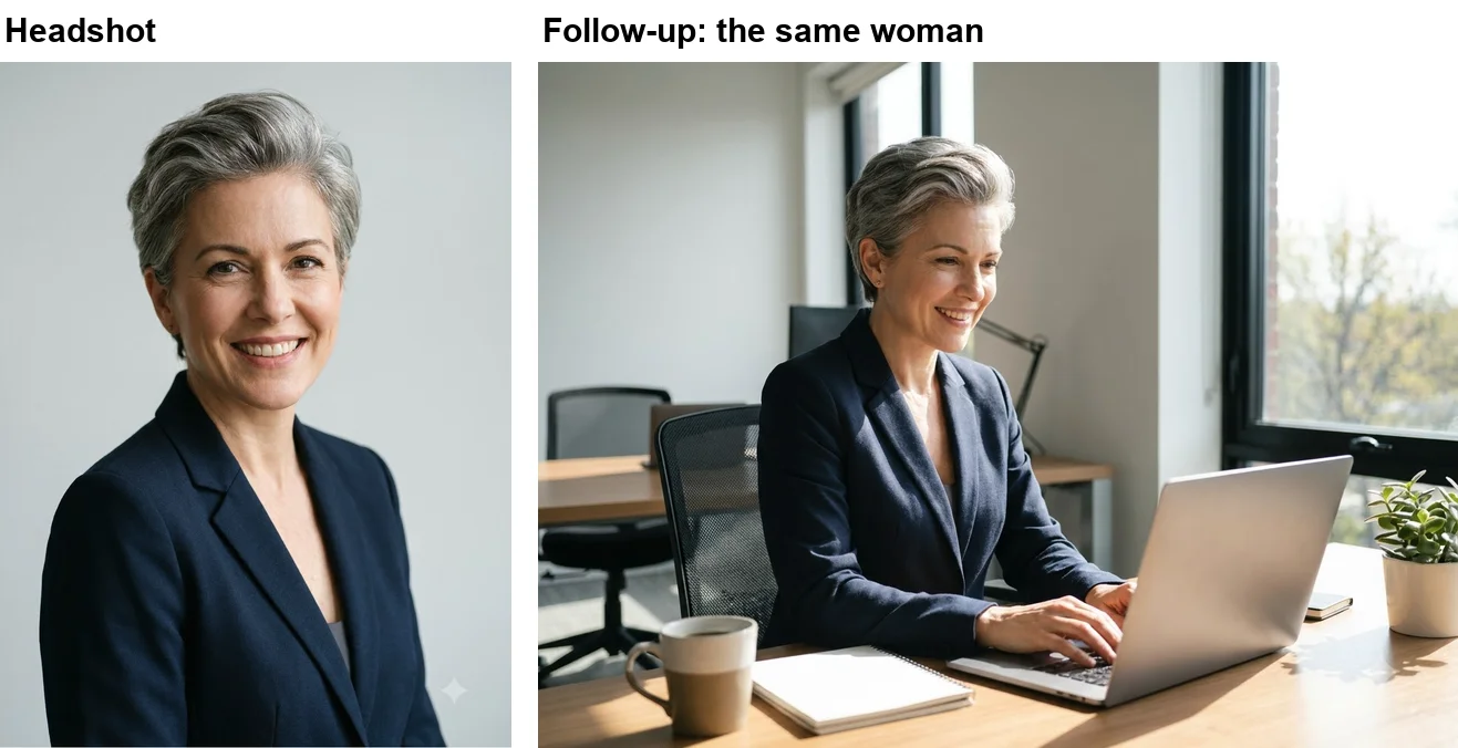
The headshot is a convincing studio photo that follows every part of the brief. The follow-up, sent in the same Flow chat, kept the hairstyle, the blazer and a very similar face, and Flow’s agent said it had kept her character consistent. It is close enough for a series of images on one site, but not a guaranteed identical face. Google’s guide has a separate formula for prompts that include reference images, which I did not test here.
A world-knowledge prompt: landmarks
Google’s developer docs say Pro offers “the highest level of world knowledge” of its Nano Banana models. One prompt tested that against famous buildings.
Three famous landmarks side by side, each drawn accurately and labelled with its city underneath: the Eiffel Tower (Paris), the Colosseum (Rome) and the Sydney Opera House (Sydney). Detailed travel-sketch style in ink and watercolour.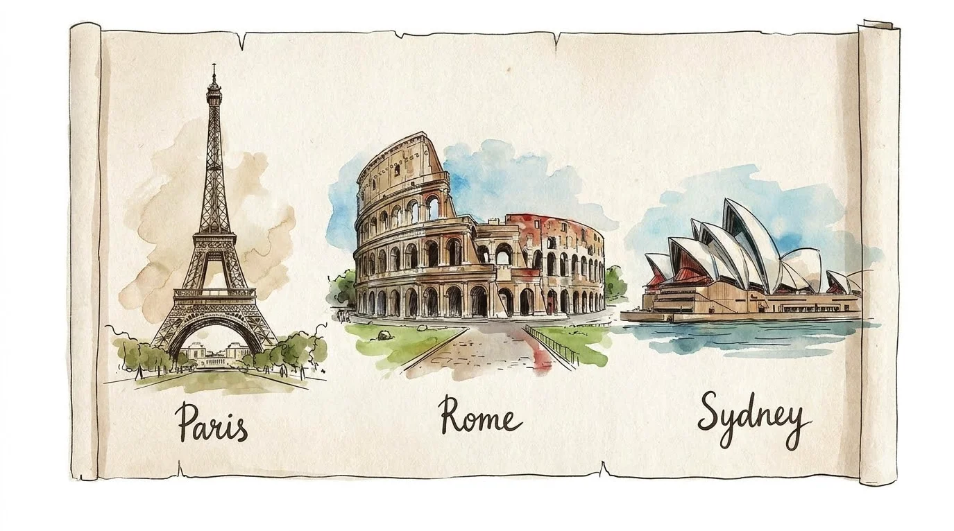
All three are recognisable at a glance, including the Colosseum’s broken outer wall and the Opera House’s overlapping shells, and the three city labels are exact. It added a parchment scroll as a frame, which I did not ask for.
I included “drawn accurately” to steer the sketch style away from loose drawing; I did not test the prompt without it. If you need a recognisable place for a travel post or a school sheet, name the landmark and its city in the prompt, as here, rather than describing it, and let the model’s knowledge supply the details.
Why use Pro rather than Nano Banana 2 for these
Use Pro when the printed words must match exactly. When I ran the same eight prompts through both models for our Nano Banana Pro vs Nano Banana 2 test, the difference showed up mostly in what each model added, not in spelling.
| Prompt in that test | Nano Banana Pro | Nano Banana 2 |
|---|---|---|
| Concert poster | Exact, nothing added | Exact, plus three additions |
| Menu, diagram and map | All exact | All exact |
| Seven-part street scene | 4 of 7 | 5 of 7 |
| Portrait and hands photo | Closer to the brief | Younger face, an extra foot |
On the poster, Nano Banana 2 added a weekday and a web address nobody had supplied. That matches what I saw here: Pro’s extras were about half framing, such as a room, a kitchen or a scroll, and half text or a logo, including one line I wrote that it changed, on the recipe card. A labelled diagram or menu was equally accurate on Nano Banana 2 in our one comparison.
Cost decides the rest. In Google Flow both models cost me nothing. On Google’s API, Nano Banana 2 is $0.067 for a 1K image against Pro’s $0.134, so drafting on Nano Banana 2 saves $6.70 per 100 drafts at 1K, which adds up only at volume. For one person making a few posters a week in Flow, use Pro for everything with words in it while Flow’s free access lasts; Google calls it limited.
A five-step structure for Pro prompts
Across the sixteen, this is the structure I would start from. It is Google’s formula with the fixes from my second round built in.
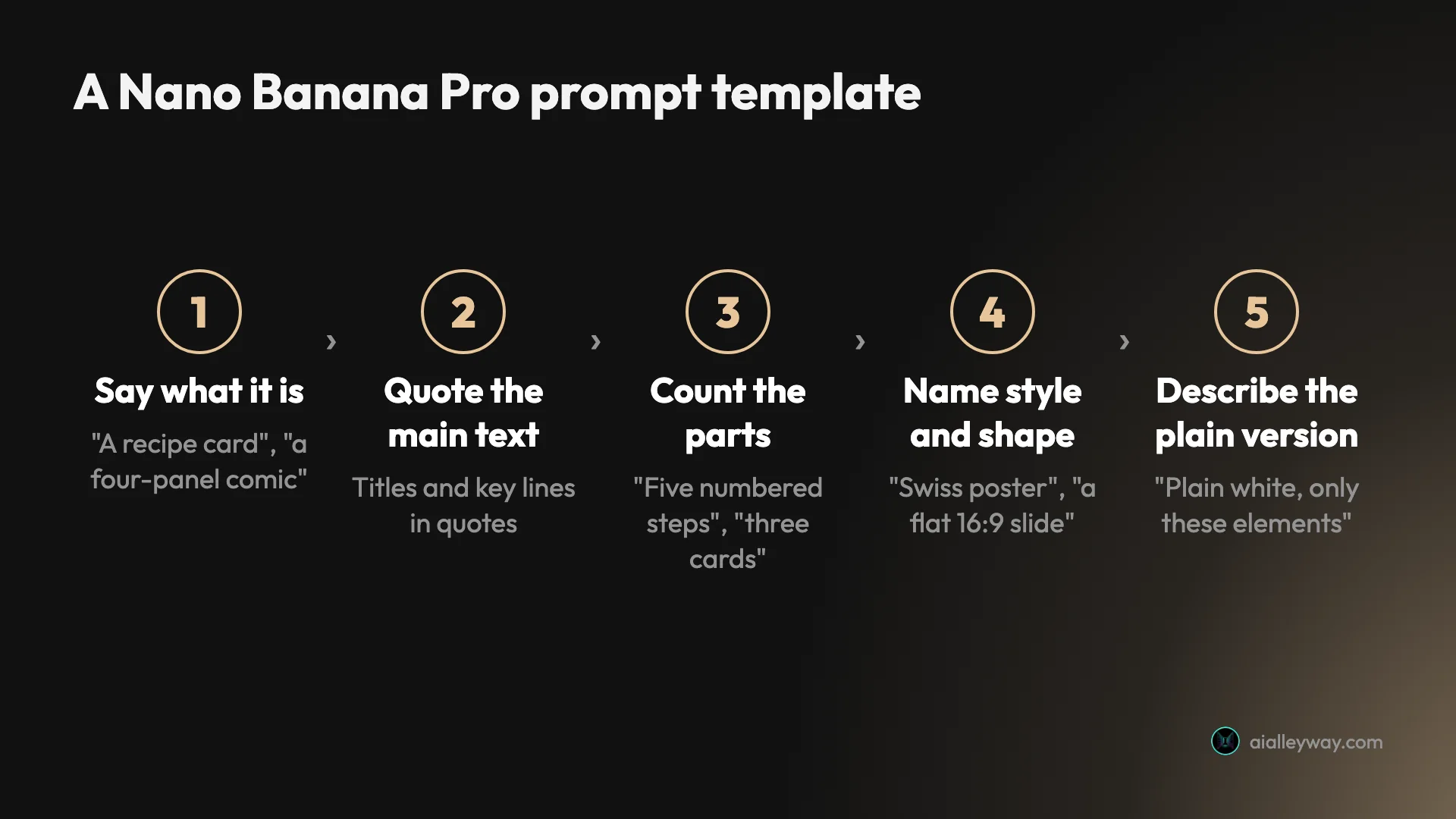
- Say what the thing is. “A recipe card”, “a four-panel comic strip”, “a front label for a jar of honey”. This sets the layout first.
- Quote the main text. Titles, headlines and key lines. Every quoted string came back right, though so did unquoted labels.
- Count the parts. “Five numbered steps”, “four labelled slices”, “three habit cards”. With counts, every layout came back complete.
- Name the style and the shape. “Modern Swiss poster design”, “a flat 16:9 slide”. When I wrote the shape into the prompt, Flow followed it three times out of three.
- Describe the plain version. “Plain white background, containing only these three elements.” This is Google’s positive framing. My rewritten slide came back without the logo and the room, in one run with several wording changes at once.
The two rewrites in the infographic and slide sections show the template applied. Our earlier Nano Banana prompts test found the same thing from the other side: a bare “no other text” failed on a busy brief (it worked on simpler ones).
Where correct images still went wrong
None of these were spelling errors. They are the ways a correct image still came back not quite usable, and what I tried for each one.
| What happened | First 12 prompts | Fix tried |
|---|---|---|
| Shape setting ignored | 5 of 12 | Shape written in the prompt (3 of 3, a small sample) |
| Unasked text or a logo | 4 of 12 | Describe the plain version (slide and infographic; others not rerun) |
| Unasked staging (room, kitchen, scroll) | 3 of 12 | ”A flat slide that fills the whole frame” (slide only; kitchen and scroll not rerun) |
| Approximate chart values | 1 (the pie) | Check every value (advice, not a tested fix) |
Flow overrode the shape on five images
I set 4:3 for the last batch of the first round, and the sign, the heart and the pie came out square while the landmarks came out wide. The app screen came out as a tall phone shape instead of the 3:4 I had set. Flow’s image info panel confirmed it: the pie chart reads “Nano Banana Pro” and “1:1”. In the second round, I wrote the shape into each prompt and Flow followed it every time.
Extra text appears when the prompt leaves room for it
The infographic repeated each step name, the recipe card gained “(zest & juice)”, the slide gained a logo. Describing exactly where each label goes, or listing the only elements on the page, removed the extras on both reruns.
Charts are drawings, not calculations
Both bar charts were exact; the pie slices were within about two percentage points. That is good enough for a social post and not for a board report. Check every value, and use a real chart tool when the numbers have to be exact.
Diagrams look authoritative even when simplified
The heart diagram has every label on the right part, yet its vessels and chambers are drawn in a simplified way. Pro draws a convincing textbook look whether or not the detail is right, so have someone who knows the subject check anything educational.
Flow adds a watermark and small previews
Most of my images carry a small sparkle watermark in the corner, though it is hard to see on white, and on my account, which is set to Vietnam, the setting to remove it is locked. Three of my images also showed only a 512-pixel preview until I reloaded the Flow page, after which the full-size file loaded. Reload before you judge sharpness, and download the full size.
Start from the prompt closest to your job
Use the table to pick a starting point, swap in your own words, and keep the structure.
| Job | Start from | Add this line |
|---|---|---|
| Poster, label, sign or packaging | The book fair poster or the honey label | Your exact lines in quotes |
| Slide or simple chart | The rewritten slide | ”Only these elements”, the shape, and “a labelled $0 to $80k axis” if you need a scale |
| Explainer or how-to graphic | The rewritten infographic | ”Label each step once” |
| Comic or storyboard | The comic strip | One quoted line per panel |
| Portrait series | The headshot, then the follow-up | ”The same woman from that headshot” |
Skip Pro if your image has no words in it and you are on the free Gemini app: Nano Banana 2 is free there and tied Pro on a product shot in our comparison, though Pro drew the cleaner hands and the truer portrait. Our general Nano Banana prompts guide covers photos, edits and characters on the free app.
Bottom line: quote it, count it, describe the plain version
Nano Banana Pro is the model to prompt when the words in an image matter. In sixteen tries it never misspelled anything, and on the first round half the images came back exactly as written. The other half taught the useful lesson: Pro often fills empty space with its own guesses, and describing the plain version you want, with the shape written in, fixed both prompts I reran. Start in Google Flow, where all sixteen cost me nothing.
Frequently asked questions
What are the best prompts for Nano Banana Pro?
Prompts with words in them. In my test of 16 prompts on 3 October 2026, Nano Banana Pro spelled everything correctly across a poster, a label, a slide, a recipe card, an app screen and a sign in four languages. Of the first 12 prompts, six came back with exactly the text I asked for and nothing else.
The pattern I used: say what the thing is, quote the main text, count the parts, then name the style and the shape. On the two prompts I rewrote, describing the plain version removed the extras.
How do you write a good Nano Banana Pro prompt?
Describe the image in sentences, not keywords. Google's own prompting guide gives a formula of subject, action, location or context, composition and style, tells you to put the words you want in quotes and describe the font, and advises positive framing: describe what you want rather than what you do not want.
Two things from my test to add: state the shape in the prompt itself, because Google Flow ignored my shape setting on 5 of my first 12 prompts but followed the shape on all 3 prompts where I wrote it in, a small sample, and describe the plain version you want, such as a flat slide on a white background with only these elements.
Can I use Nano Banana Pro prompts for free?
Yes, in Google Flow. On a free Google account with no Google AI plan, I picked Nano Banana Pro in Flow's settings and ran all 16 prompts in this guide; my 50 daily Flow credits were still at 50 afterwards. Google's subscriptions page describes the free tier's Flow access as including limited access to Nano Banana Pro.
In the Gemini app, Nano Banana Pro needs a Google AI plan, and on the API it costs about $0.134 per 1K or 2K image.
Is Nano Banana Pro good at text in images?
Very good, in my test. Across my first 12 prompts there were 69 text items to print by my count, from one word on a bottle to a recipe with five ingredients and three numbered steps, and I found no misspellings, including the German word Geöffnet with its umlaut.
What it sometimes did was add text: a second set of step names on an infographic, "(zest & juice)" after a lemon on a recipe card, and a made-up logo on a slide. Describing the plain version you want, such as "label each step once" or "only these three elements", removed the duplicate labels and the logo when I reran the infographic and the slide; I did not rerun the recipe card.
Can Nano Banana Pro make accurate charts?
For simple charts, yes. Both of my bar charts had bars in exact proportion to $42k, $51k and $63k, and my pie chart's slices came out within about two percentage points of the 38, 33, 17 and 12 percent I asked for.
It is still drawing a picture of a chart, not calculating one, so check every value before you use it in a report, and use a real chart tool when the numbers matter.
Is there a Nano Banana Pro prompt generator?
Gemini itself can do that job. Google's prompting guide says Gemini 3 can help you create prompts and with creative direction, and it recommends talking the wording of any text through with Gemini before asking for the image. In Google Flow, the chat agent also reads your request before it generates, and it can reword it.
Third-party prompt generators exist, but they generally do not show you a tested result. Starting from a prompt with a known result, like the 16 in this guide, and changing the details is a quicker route.
Where can I find more Nano Banana Pro prompts?
Prompt libraries collect thousands of prompts with example images, and community threads on Reddit share long lists. They are useful for ideas, but most show the best result someone got, not how often the prompt works.
Each prompt in this guide was run once, on the same day, with the result shown next to it; two are rewrites of earlier prompts, so you can see both the first attempt and the fix. Our separate Nano Banana prompts guide covers photos, edits and characters on the free Gemini app.
Keep reading
Nano Banana Prompts: 15 I Tested, With the Results
Nano Banana prompts for headshots, product shots, thumbnails, stickers, logos and edits, each tested in Gemini with the result, and what it ignored.
Nano Banana Pro vs Nano Banana 2: 8 Prompts, Tested
Nano Banana Pro vs Nano Banana 2 on the same 8 prompts: Pro added nothing to a poster, Nano Banana 2 costs half per 1K image. Which to use, and when.
Nano Banana Pro Free: Where It Actually Works, Tested
Nano Banana Pro free, tested on a free Google account: it worked in Google Flow at no credit cost, but not in the Gemini app or AI Studio.
Nano Banana Pro Pricing: $0 to $0.24 per Image
Nano Banana Pro pricing in full: $0.134 per 1K or 2K image and $0.24 per 4K on the API, half that in batch, plans from $4.99, and one route that cost me $0.